Showing posts with label Masking Tape. Show all posts

Wednesday, November 23, 2016

Watercolor Nebula or Galaxy

Goal


Inspiration

"How to Paint a Galaxy with Watercolor -- a Nebula -- Universe" via ArtVilla.

Materials

  • Some probably hot-press watercolor paper I cut into approximately 3.5" • 5" rectangles.
  • Various color papers cut into slightly larger rectangles for 'faux' matting.
  • A pack of white 5.25" • 7" blank white scored cards and envelopes.
  • Some quality watercolor brushes my aunt gave me upon her trip from England.
  • A 24 pan set of Yarka St. Petersburg Artists' Watercolors she also gave me.
  • A roll of 1" 3M Scotch Masking Tape.
  • A hard back vinyl-cover binder to tape the paper to.
  • A jar for water, and lots of rinses and refills.
  • Salt -- I used a fine sea salt because it was the coarsest I have. 
  • Opaque white paint. 
  • A tiny, gentle spray bottle full of plain, fresh water.


Step 1:  Prepare the colors for the first layer.

  • A light + dark red mixture.
  • A cherry.
  • A darkish blue.
  • A blue-ish green.


Step 2:  Wet the paper on a slight angle.

A lot of water allows the paints to bloom together across what would otherwise be white space.  Having the paper slightly tilted lets gravity aid the process.

Optional, first tape the paper to your surface to mask the edges.
Tip:  Stick the tape to clothing before applying to the paper.  This isn't the first time I've tried it, but I read online that this will keep it from tearing the paper.  However, this seems to tear the paper.  This time I tried sticking it twice to clothing.

Step 3:  Place colors and let them bloom together.

Place a few large, abstract blobs of each dilute hue about the paper.  Don't use too many or place them too closely, or you'll end up with mud.

It started out too wet, and there were pools of muddying waters at the bottom edge, but it didn't stay wet long enough to get through the whole process--next time I'll remember to use the spray bottle!
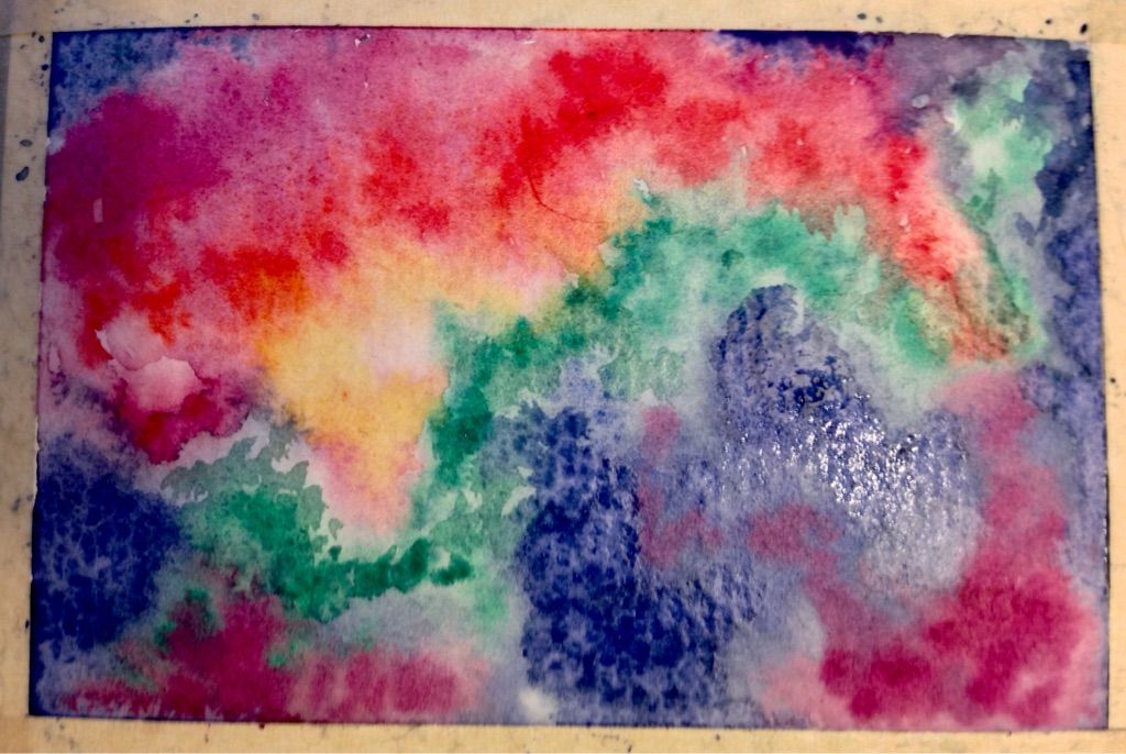


Step 4:  As the paint begins to dry, add more intense pigments.

Place smaller abstract dabs of less dilute, pure pigment about the paper as it begins to dry.  These will still spread and bleed a bit, but not as much as on the wetter paper.

As the paint continues to dry add smaller dabs of even more intense pure pigment.


Step 5:  Sprinkle salt.

You want uneven distribution, some larger salt concentrations in the center of the nebula, and smaller ones further out.

In my case, I let the painting dry too much before I salted it, so I spritzed it with a tiny, gentle spray bottle full of plain water.  Also, in my hurry, I over-salted some areas, and the salt that doesn't dissolve will have to be carefully rubbed off.
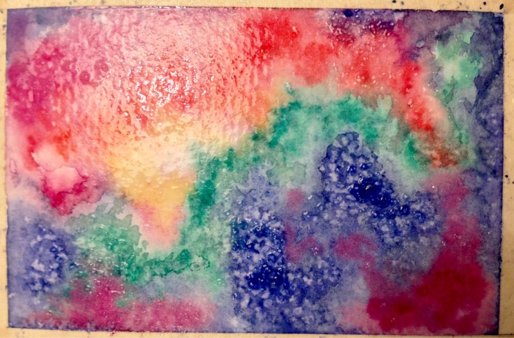


Step 6:  Let the painting dry completely.

Rinse your brush(es) and change the water.

Step 7: Remove the salt.

Using clean hands, a paper towel, or a small piece of new kitchen sponge, gently brush off the salt.

This image looks more intense than the painting at this stage, which is dry.
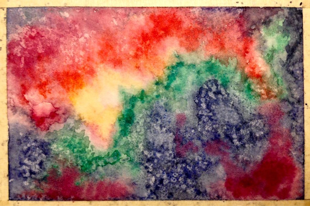

Step 8:  Wet the paper on a slight angle.

This is the same as the second step.  Do this quickly so as to minimize disturbance of the underlying layers of paint.


Step 9:  Add more intense, pure pigments on this layer.

Use yet more intense pigments to add this layer.

On this small scale, this step covered up the salt patterns, which weren't as dramatic as in the demonstration.  I'm tempted to do another salt stage, but I should follow along, and proceed to the next step.


Step 10:  With the paper still slightly damp, add dark borders.

This will be a dark blue-purple that fades toward the center.  Make sure to fuzz the edges of the borders around the center, so it has a natural cloud-edge.
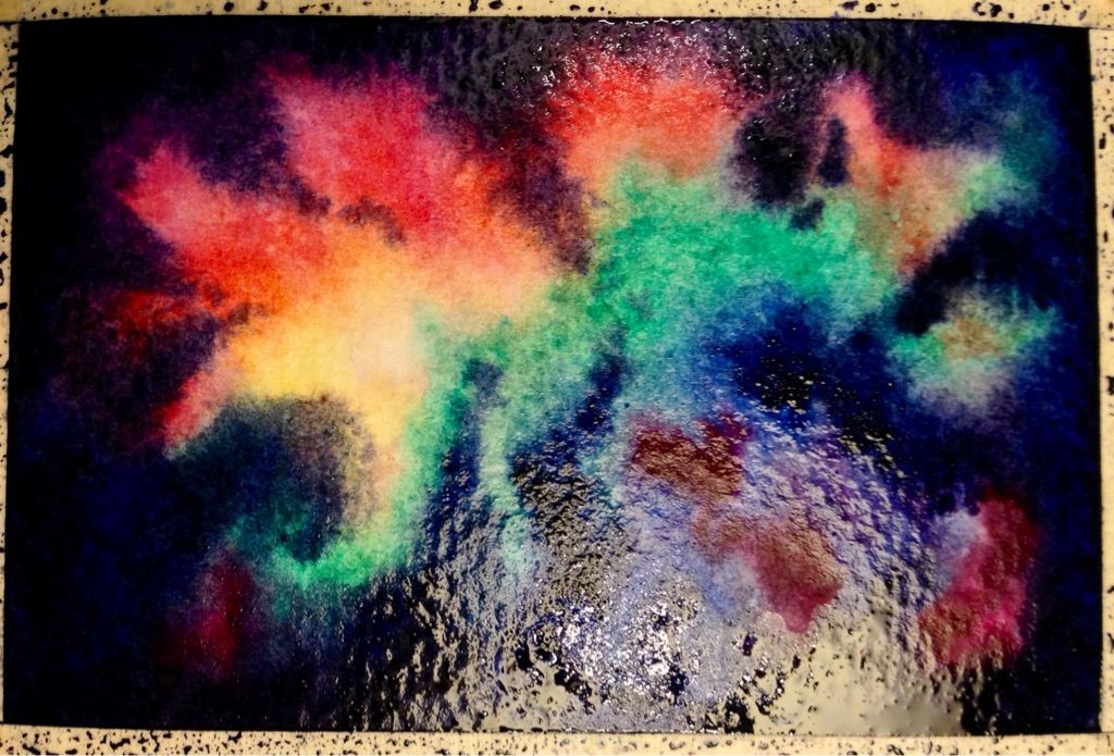

Step 11:  Let the painting dry completely.

Rinse your brush(es) and change the water.


Step 12:  Splatter the stars.

Using opaque white paint with a lot of pigment and little water, load a fine-tip brush, and tap it gently, perpendicularly to another brush handle.  Different amounts of of paint on the brush, and different tap strengths will create smaller and larger splatters.  You want tiny star-like dots unevenly spread about the nebula.  Don't worry about small groupings of 'stars' or non-circular 'dots' because a few of those would be naturally seen in the night sky.  Try practicing this technique on scrap paper or a sheet of paper you keep for testing techniques.
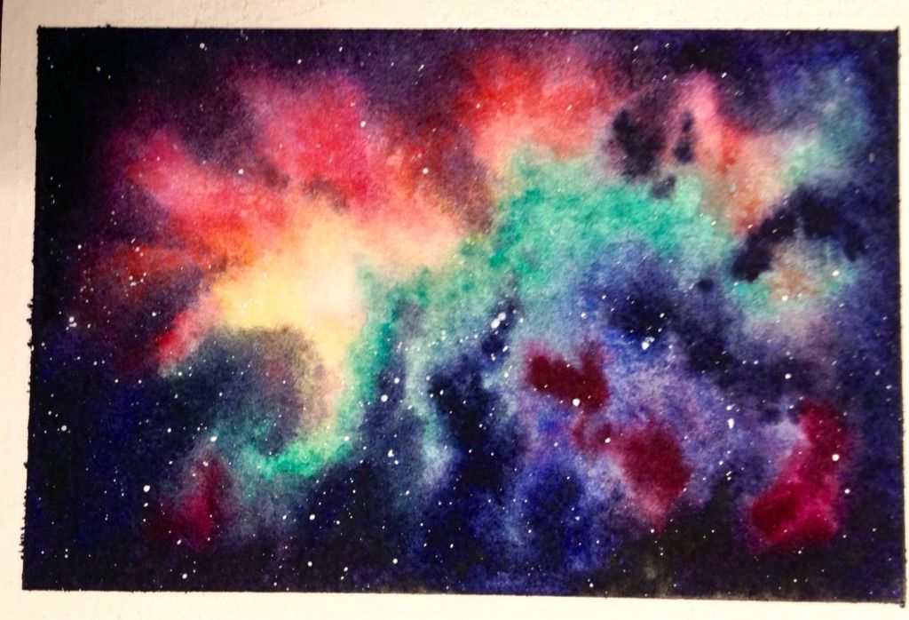
Step 13:  Let the painting dry completely and remove the tape.

Rinse your brush(es) and change the water.


Results

I left the tape on a blank card on for a week or two--far too long.

I need to make a physical color scheme so I test my mixes in advance, and note the names of the colors I use.

I think I missed a layer of color, and if the middle layer is more washed out in the middle, it won't obscure the salt effect.

I like the overall result.  Making the above changes should make the painting go faster
and ultimately also look more realistic.  T
his is greeting-card size, so it will do double duty
as part of a set of greeting cards I'll give as a Christmas gift.

Sunday, November 20, 2016

Watercolor Red Carnations


Goal


 Inspiration


A visual step-by-step tutorial of red carnations.

Materials

  • Some probably hot-press watercolor paper I cut into approximately 3.5" • 5" rectangles.
  • Various color papers cut into slightly larger rectangles for 'faux' matting.
  • A pack of white 5.25" • 7" blank white scored cards and envelopes.
  • Some quality watercolor brushes my aunt gave me upon her trip from England.
  • A 24 pan set of Yarka St. Petersburg Artists' Watercolors she also gave me.
  • A roll of 1" 3M Scotch Masking Tape.
  • A hard back vinyl-cover binder to tape the paper to.
  • A jar for water, and lots of rinses and refills.


Step 1:  Tape and sketch.

Tip:  Stick the tape to clothing before applying to the paper.  This isn't the first time I've tried it, but I read online that this will keep it from tearing the paper.  However, this seems to tear the paper.  This time I tried sticking it twice to clothing.

Sketch the image lightly.  You can't erase pencil lines after you paint over them.  You could sketch in a watercolor pencil.


Step 2:  Prepare your color scheme.

I skipped making a physical color scheme because the Value Chart I'd just made was still drying on the back of the pad of watercolor paper I have but don't like.  Looking at that, I visually chose Ruby (transparent) and used that alone on the front right petal of the large carnation.  The other petals have a touch of Quinacridone Rose (transparent), and the darkest ones also have Claret (transparent).  For the stems, I think Lemon (transparent), Azure Blue (transparent), and Green Light (transparent).  I had to do several washes because my yellow was too intense, I should have painted the stems in sections as indicated, and I forgot to test my mixes on the color scheme page.


Step 3:  Paint the petals.

Paint the petals one at a time, letting each petal dry before painting its neighbors.  For the front two petals, fill each with a water wash, and add pigment to the base, drawing it towards the frilly edges and letting it fade the further from the stem it gets.  The darker petals are filled in fairly solidly with pigment.  Next time I will do an all-over wash of petals and stems first.


Step 4:  Paint the stems.

Paint the green portions all at once, starting with a wet, blotchy layer of yellow, adding daubs of blue, and allowing them to bloom, or coercing them if necessary.  A hint of orange or red would be appropriate on the receptacle, near the petals.


Step 5:  Remove the tape.

The paper didn't tear when I removed the tape this time.  I will start sticking it twice to clothing before using it on the paper.

Results

Sticking the masking tape to clothing twice before applying it to the paper kept the tape from tearing the paper upon removal.

I need to make a physical color scheme so I test my mixes in advance.  I should use my palette to actually make the mixes. 

I should have done a pale yellow wash (or blue) first, so the flowers would have a background.  I should have also done a pale red wash on the overall petal area and a pale yellow-green over the stem area.

I like the overall result.  Making the above changes should make the painting go faster
and ultimately also look more realistic.  T
his is greeting-card size, so it will do double duty
as part of a set of greeting cards I'll give as a Christmas gift.

Saturday, November 19, 2016

Watercolor Sunflowers

Goal

Remember no one but you will know exactly what your source looked like.  These are different sunflowers than are shown in the images I looked at!

Inspiration

I took my inspiration from the instructor's painting second from the right on the bottom row.


Materials

  • Some probably hot-press watercolor paper I cut into approximately 3.5" • 5" rectangles.
  • Various color papers cut into slightly larger rectangles for 'faux' matting.
  • A pack of white 5.25" • 7" blank white scored cards and envelopes.
  • Some quality watercolor brushes my aunt gave me upon her trip from England.
  • A 24 pan set of Yarka St. Petersburg Artists' Watercolors she also gave me.
  • A roll of 1" 3M Scotch Masking Tape.
  • A hard back vinyl-cover binder to tape the paper to.
  • A jar for water, and lots of rinses and refills.
  • Salt -- I used a fine sea salt because it was the coarsest I have.


Step 1:  Tape and sketch.

Tip:  Stick the tape to clothing before applying to the paper.  This is the third time I've tried it, but I read online that this will keep it from tearing the paper.  I now know I need different tape, but I've not bought it yet.


Step 2:  Prepare your color scheme.

Start with a triangle of three primary colors.  Mix the indicated secondary colors and then mix complementary colors for the browns.  I learned this trick from a local artist who was doing a watercolor demo at a local art store.


Here you can see I tried several of each of the primaries, because I the Inspiration page didn't suggest colors.  I chose Golden Deep (transparent) because it was sunflower-like, and the Naples Yellow (opaque) seems too muddy.  I chose Indigo (opaque) for the background because I want a deep, intense blue.  It mixes well with the Golden Deep to make a nice brown.  Blue Lake (transparent) and Indigo both mix nicely with Lemon (transparent) for similar Yellow-Greens.  Lemon with Green Light (transparent) makes the best Green-Yellow of my three greens.  My other yellows were too orange for this purpose.  I chose Quinacridone Rose (transparent) because it made the best oranges with the Golden Deep.  An X indicates a choice I didn't use; the circled daubs are the ones I selected for use.

The Green Underpainting is Lemon, while the Sunflower Underpainting is a mix of Golden Deep and Lemon.

I let the colors in the centers of the bloom and then used a salt technique to create the texture.

Label your hues, diagram your mixes, and label final key colors.  Mix up large enough amounts.  This doesn't take as much pigment as I'd feared.  If you don't mix up large enough amounts, be sure to leave room on your color scheme page to test new batches.


Step 3: Apply the under-paintings for the stems, leaf, and the flowers.  

Using the Green Under-painting mix, wash the leaf and stem areas.  This will dry quickly.  Working from the edges of the flowers opposite of the leaf and stems, pre-wet the paper in the flowers and wash them with a mix of Lemon and Golden Deep, blobbing each on in different areas and allowing them to bloom together.  Use a touch of the Yellow-Green mixture for the centers.


Step 4: Add shading to the leaf and stems; paint the flower centers. 

The image above is still wet; you can see the paint fades as it dries, as shown with the sunflower wash below.  Use the Yellow-Green mix to add highlights to the leave and stems; use the blue-green mix to add shadows to them.

Lightly pre-wet each flower center, one at a time, and add brown and orange mixtures to the outer edge, Yellow-Green to the middle, and Lemon in between, allowing them to bloom together.  If it becomes muddy, daub with a rolled-up paper towel and try again.  The flower center in back should be slightly fainter.  When the paint is no longer pooled but is still shiny, sprinkle the centers lightly with salt.  The salt will dissolve, changing the surface tension in minute areas of the water, pushing and pulling the paint into abstract textures.  Too much salt won't dissolve well, and will be harder to brush off.  If the paint is too dry, this technique won't work well.  Let this stage dry completely.  The centers below are still wet, so the colors seem more intense than I want in the final product.  The stem on the bottom right is too faint, so it will need another layer of wash and shadow.


Step 5: Let the painting dry completely.

Rinse your brush(es) and change the water.

Step 6: Remove the salt.

Using clean hands, a paper towel, or a small piece of new kitchen sponge, gently brush off the salt.

I added another layer to the leaf and stems.  I started to add another layer to the front flower, painting each one individually, but it wasn't coming out as I wanted, so I made it a light wash, something that can easily be obscured by another layer, but will also add variation to the petals.


WORK IN PROGRESS

Tuesday, November 15, 2016

Watercolor Squash on a Table

Goal

Inspiration

A step-by-step watercolor tutorial from a watercolor demo at an art supply store.  First, follow the tutorial and make a small painting that will become a card as part of a set that will be given as a gift.  Practice using masking tape for the second time.

Materials

  • Some probably hot-press watercolor paper I cut into approximately 3.5" • 5" rectangles.
  • Various color papers cut into slightly larger rectangles for 'faux' matting.
  • A pack of white 5.25" • 7" blank white scored cards and envelopes.
  • Some quality watercolor brushes my aunt gave me upon her trip from England.
  • A 24 pan set of Yarka St. Petersburg Artists' Watercolors she also gave me.
  • A roll of 1" 3M Scotch Masking Tape.
  • A hard back vinyl-cover binder to tape the paper to.
  • A jar for water, and lots of rinses and refills.


Step 1:  Tape and sketch.

Tip:  Stick the tape to clothing before applying to the paper.  This is the first time I've tried it, but I read online that this will keep it from tearing the paper. 


Step 2:  Prepare your color scheme.

Start with a triangle of three primary colors.  Mix the indicated secondary colors and then mix complementary colors for the browns.  I learned this trick from a local artist who was doing a watercolor demo at a local art store.

I started with Naples Yellow (opaque), Indigo (Semi-transparent), and Ruby (transparent).


I chose Indigo because it was my most intense blue and it looked closest to the Ultramarine Blue suggested by the tutorial.

I chose Naples Yellow because to my eye, it best matched the New Gamboge yellow used in the tutorial, however as shown below, I have an 'inner circle' of sorts where I chose Hansa Yellow (transparent), because it makes better greens with the Indigo.

I chose Ruby because it was closest in intensity to the tutorial's indicated Windsor Red.  The two paler reds are tested outside of the Red circle.

I mixed Ruby and Hansa Yellow for an orange, then mixed that with varying amounts of Indigo to create Light Brown and Dark Brown (triangles in the center of the diagram).  I mixed Hansa Yellow with different amounts of Indigo to achieve the Yellow-Green and Blue-Green Mixes.

I tested a wash of dilute Hansa Yellow with a touch of each of Indigo and Ruby for the Squash Under-painting.  The Background Mix is Hansa Yellow with a touch of Light Brown.  The dabs next to that square are where I tested subsequent mixes because I didn't mix enough volume the first time.

I forgot to test the Indigo and dilute Indigo I used for under-painting the shadows with the final mixed colors layered over them in the bottom-right corner of the page.

Label your hues, diagram your mixes, and label final key colors.  Mix up large enough amounts.  This doesn't take as much pigment as I'd feared.  If you don't mix up large enough amounts, be sure to leave room on your color scheme page to test new batches.

This is my palette at the end.  I washed it after I made the Color Scheme because I had some muddy mixes there.  Next time I might use a separate palette for that.  Counter-clockwise from the top:

The yellow turned into Orange; there was the Underpainting and then the Background Mixes, which were mixed with Ruby for Orange, then diluted for a Yellow-Orange wash.

The Indigo was used up by the end; various dilutions were made in this section.

Yellow-Green and Blue-Green were made side-by-side in the same section.

Dark Brown.

Light Brown.  

Step 3: Apply the under-painting for the wall and the squash.  

Using the Squash Under-painting mix, wash the squash and stem areas.  Pre-wet the paper in the Squash highlight area with clear water.   Dilute the same hue and wash the wall.


Step 4: Let the washes dry; continue to the next (non-overlapping) step.

Rinse your brush(es) and change the water.


Step 5:  Apply the shadow under-painting and textures.

Using dilute Indigo, apply a wash to the shadow of the squash and the edge of the table.  Using a less-dilute Indigo, apply a darker shadow to the apron of the table, using long strokes and a long, thin brush to indicate the grain of the wood.  When the shadow wash is dry, using short strokes and a fine brush, add wood grain texture in the squash shadow and on the edge of the table.

Under-paint the stem of the squash, and using a small, short, blunt-cut tip brush, apply the shadow layer of the squash texture.  Dilute the Indigo in steps to apply lighter shadows.  It doesn't need to be identical to the example.  Use more dilute Indigo or a different blue.


Step 6: Let the paint dry a bit.

Rinse your brush(es) and change the water.


Step 7: Paint the squash pattern on the light side, then the shadow side.

Use the Hansa Yellow, the Orange mix, and some Ruby for the darkest parts, mixing and diluting them as you go to get fainter colors.

Rinse your brush(es) and change the water.

Use the Blue-Green mix for the darkest parts, diluting it as you go to get fainter greens.  Use a long thin brush on the stem.

Using a tiny, almost-dry brush, sketch faint Blue-Green and Yellow-Green outlines around the Orange parts.


Step 8: Let the paint dry a bit.

Rinse your brush(es) and change the water.


Step 9: Paint the table.

Using the Dark Brown Mix, apply a wash to the apron of the table, using long strokes for wood grain.  Using Dark Brown Mix with short strokes and a long, thin brush to indicate the grain of the wood on the table edge.  Use the Light Brown Mix and short strokes with the same brush, apply wood grain to the table top, making sure the lighter side is, well, lighter. 


Step 10: Let the paint dry a bit.

Rinse your brush(es) and change the water.

Step 11: Paint the wall.

Using the Background Mix, apply a heavy wash to the top of the wall; the wall can be painted unevenly for a little texture.  Keep the wall wet, using a small brush for tight corners and edges, and a large brush for larger spaces.  Continue a light wash over the table top.

Step 12: Let the paint dry a bit.

Rinse your brush(es) and change the water.

Step 13:  Soften the squash with glazes.

Use a dilute Yellow-Green Mix to wash the shadow side and the stem.  Use a dilute Orange Mix to wash the light side.  Scrub a bit of pigment off of the highlight with a clean, wet brush, and pick up the excess with a paper towel to add the highlight.  Use one of the Greens to touch up the shadows and lines of the squash, where necessary.


Step 14: Let the paint dry.

Rinse your brush(es) and change the water.

Step 15:  Add texture; make any other corrections.

Use more brown washes or wood-grain texter to adjust the table.  Add a layer to the wall if it's too light.  When the paint is completely dry, carefully use an Xacto knife to create fine scratches in the table and the stem for texture.


Step 16:  Remove the masking tape.

Do this carefully, slowly, peeling back almost on top of itself, but at an angle.

Results

The masking tape tore the edge -- I need different tape.

I need more paints; my tube paints are dried out, and my pan set has some near-empties, plus 24 hues is too limiting.

I need some different brushes.  A large pointed-tip one for washes.  One for wood-grain type strokes.  A blunter one for squash pattern.

 Overall, perfectly acceptable practice for sunflowers, but I don't care for squashes.
Also, this is greeting-card size, so it will do double duty as part of
a set of greeting cards I'll give as a Christmas gift.


Thursday, November 10, 2016

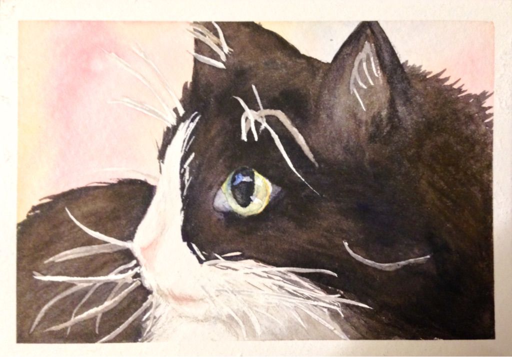
Watercolor Long-haired Tuxedo Cat

Goal

Remember no one but you will know exactly what your source looked like.  This might be a different cat than is shown in the image I looked at!


Inspiration

A step-by-step watercolor tutorial I found online, plus images of my friend's short-haired tuxedo cat.  First, follow the tutorial and make a small painting that will become a card as part of a set that will be given as a gift.  Practice using masking tape and masking fluid for the first time.

Materials

  • Some probably hot-press watercolor paper I cut into approximately 3.5" • 5" rectangles.
  • Various color papers cut into slightly larger rectangles for 'faux' matting.
  • A pack of white 5.25" • 7" blank white scored cards and envelopes.
  • Some quality watercolor brushes my aunt gave me upon her trip from England.
  • A 24 pan set of Yarka St. Petersburg Artists' Watercolors she also gave me.
  • A roll of 1" 3M Scotch Masking Tape.
  • Winsor & Newton Water Color Art Masking Fluid in 'Slightly Pigmented".
  • Old/cheap brushes for applying the masking fluid.
  • A hard back vinyl-cover binder to tape the paper to.
  • A jar for water, and lots of rinses and refills.


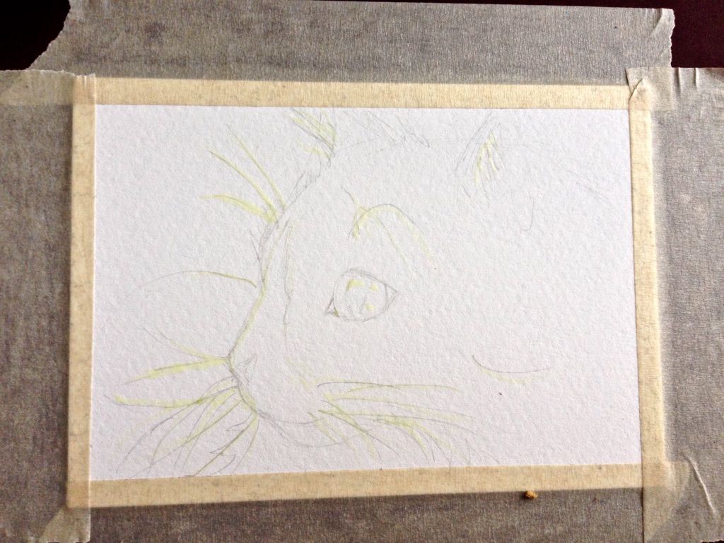
Step 1:  Tape, sketch, and mask. 

Tip:  Stick the tape to clothing before applying to the paper.  This is the first time I've tried it, but I read online that this will keep it from tearing the paper.


Step 2:  Wait at least 45 minutes for masking fluid to dry.

Thoroughly wash your masking fluid brush(es) with a little soap and water.  Rinse well.  Rinse the water jar thoroughly.

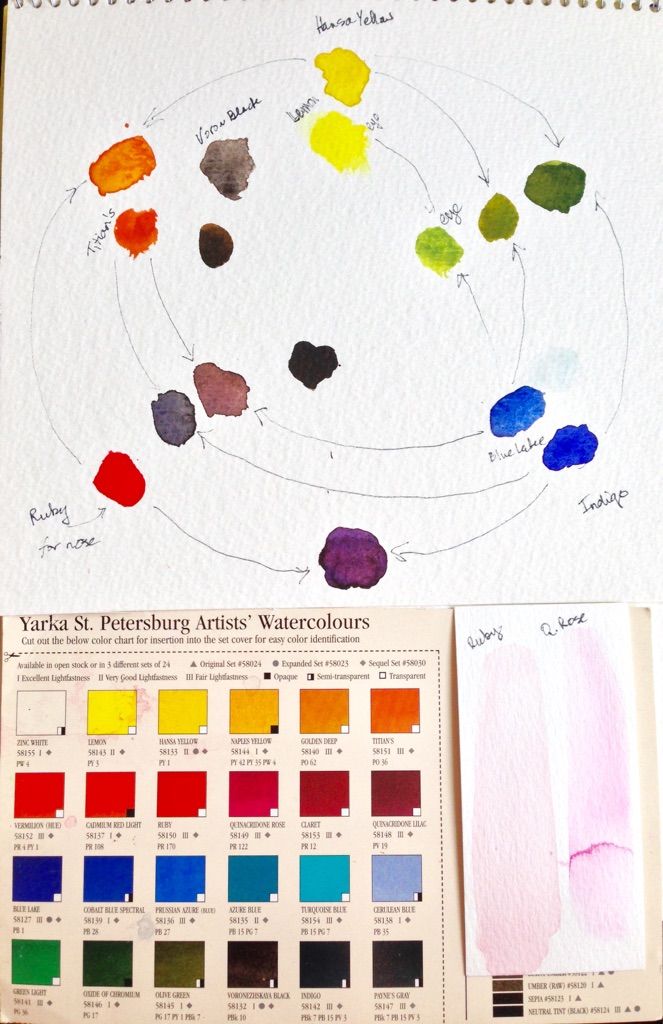
Step 3:  Prepare your color scheme.

Start with the outside circle.  Choose three primary colors.  I learned this trick from a local artist who was doing a watercolor demo at a local art store.  I've never tried it before.


I started with Hansa Yellow (transparent), Indigo (Semi-transparent), and Ruby (transparent).

I chose Indigo because it was my darkest blue and the tutorial suggested "it is so easy to achieve much more interesting blacks and grays by layering two or more complimentary colors on the paper.  A classic mix is a dark blue, such as ultramarine or prussian blue and burnt sienna (you can use any two colors that are opposite each other on the color wheel)."

I chose Hansa Yellow because to my eye, it best matched the yellow used in the tutorial, however as shown below, I have an 'inner circle' of sorts where I chose Lemon (transparent), and Blue Lake (transparent) (unlabeled, next to Indigo), because that combination gives a green that's closer to the cat's eye.

I chose Ruby because a wash of Ruby compared to a wash of Quinacridone Rose looked more like the final hue of the cat's nose. 

I mixed Ruby and Hansa Yellow for an orange, that when mixed with Indigo created a too-black greenish blob (center of the diagram).  I then chose Titian's (transparent) to mix with Blue Lake, and ended up with the bruise color next to it.  Titian's mixed with Indigo is the better grey-black outside of that.  Another option would be to use Voronezhskaya Black (semi-transparent).

Label your hues, diagram your mixes, and label final key colors like "eye" and "nose".


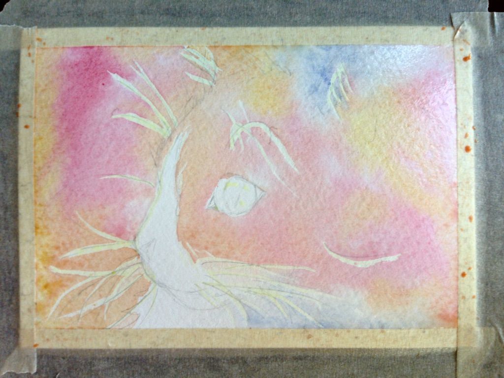
Step 4:  Apply the background wash.

I used the same colors as in my finalized scheme: Lemon, Blue Lake, Ruby, and a touch of Quinacridone Rose for the pinker hues.  This is still wet.  I probably should have added more pigment for more intensity.

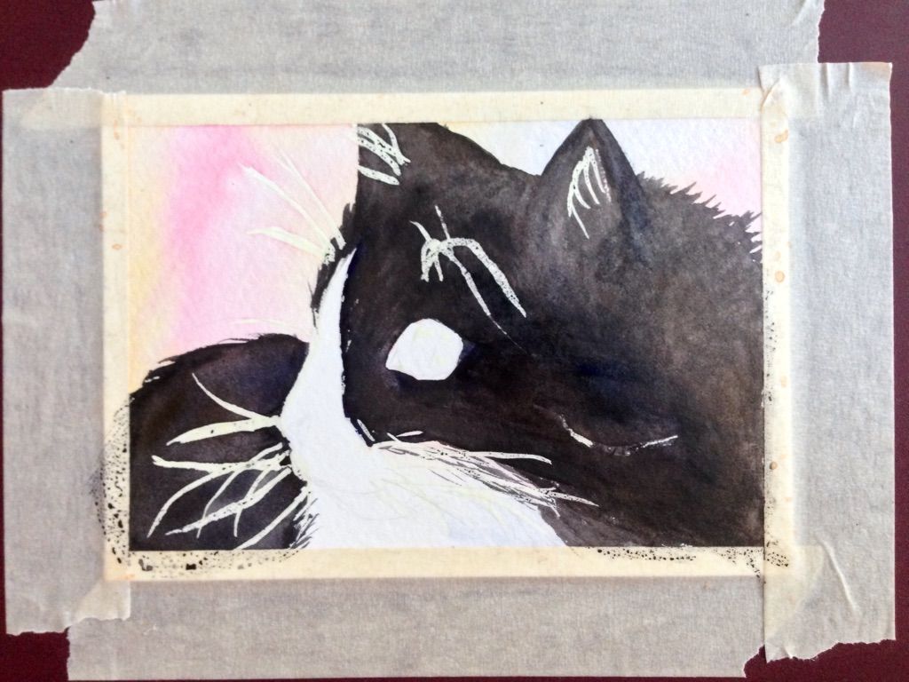
See how the masking fluid resists the paint?


Step 5:  Let the wash dry.

Rinse your brush(es) and change the water.

Step 6:  Apply the black foreground wash.


 This is a mix of Titian's and Indigo.

Step 7:  Let the foreground wash dry.

Rinse your brush(es) and change the water.

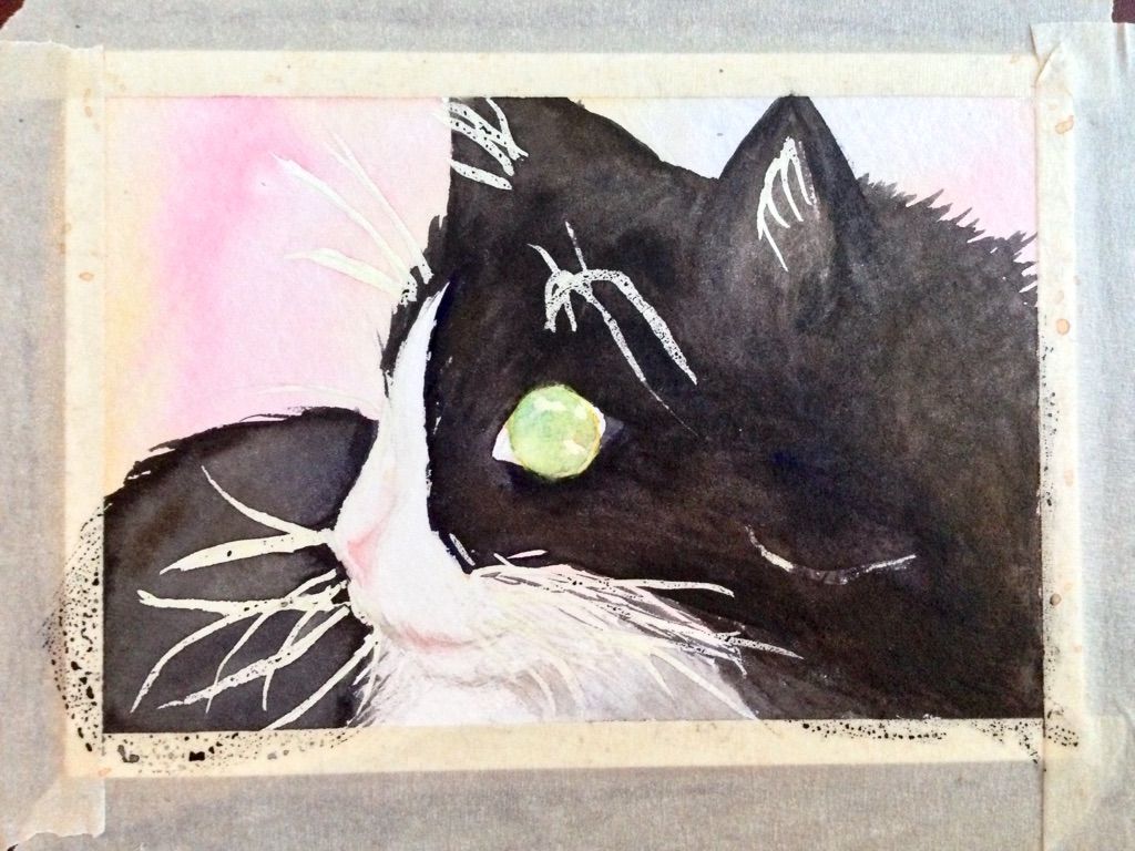
Step 8:  Apply the eye, the nose, and the shadows.


The eye is Lemon and Blue Lake.  The nose and the mouth have ruby, and the shadows are diluted Titian's and Indigo.

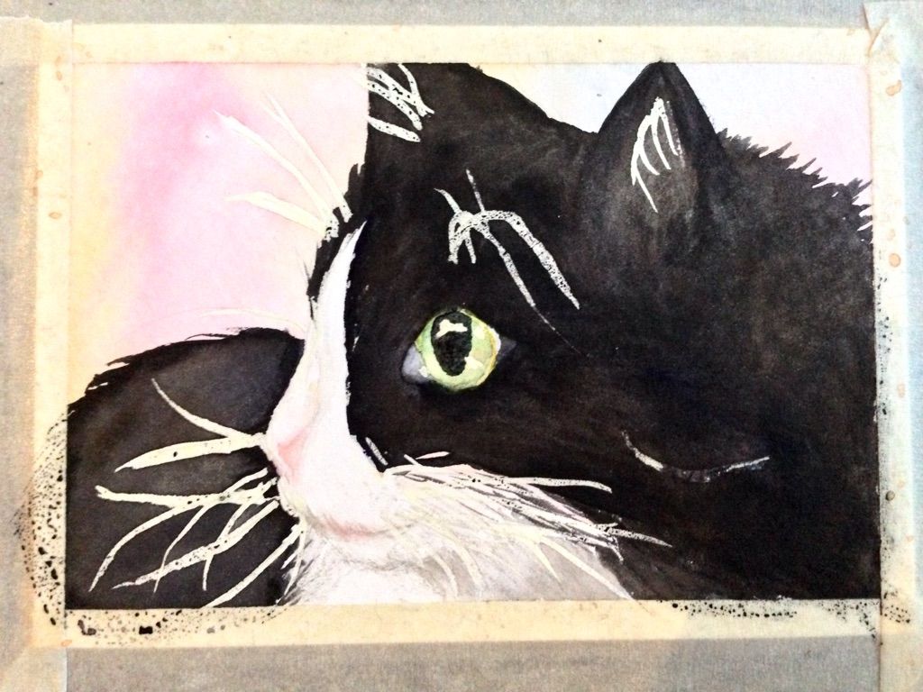
Step 9:  Apply the focal point, the pupil.  Add texture to the fur if necessary.


Titian's and Indigo, leaning slightly toward the Indigo.  Watercolor fades as it dries, so I had to add another layer of black to the pupil.

Step 10:  Let the painting dry.

I can't find anything definitive online about long long until the paint will be dry, but most sites agree you shoudn't leave the masking fluid on more than 1-2 days.

Rinse your brush(es) and change the water. 

Step 11:  Remove the masking fluid.

Do this gently with a white eraser.  The eraser may fade some of the watercolor.

Step 12:  Tone down the whites where necessary. 

Use diluted Indigo and Titian's to create shadows, "moving" some of the whiskers "back."  Add a touch of blue to the eye to indicate a reflection of an object.

Step 13:  Remove the masking tape.

Do this carefully, slowly, peeling back almost on top of itself, but at an angle.

Results

The masking tape tore the edge -- I need different tape.

The whiskers were too wide -- I need a finer brush for applying masking fluid.  Also inner-ear hairs on left weren't supposed to be white that far back.   (I ended up applying black to fix some of the whiskers.)

The colors are more faded than I wanted -- I need to use more pigment, to not be afraid of applying 'too much' and remember that it will fade as it dries.


Overall, I'm delighted with my first-ever watercolor animal!
Also, this is greeting-card size, so it will do double duty as part of
a set of greeting cards I'll give as a Christmas gift.