Goal
Inspiration
"How to Paint a Galaxy with Watercolor -- a Nebula -- Universe" via ArtVilla.Materials
- Some probably hot-press watercolor paper I cut into approximately 3.5" • 5" rectangles.
- Various color papers cut into slightly larger rectangles for 'faux' matting.
- A pack of white 5.25" • 7" blank white scored cards and envelopes.
- Some quality watercolor brushes my aunt gave me upon her trip from England.
- A 24 pan set of Yarka St. Petersburg Artists' Watercolors she also gave me.
- A roll of 1" 3M Scotch Masking Tape.
- A hard back vinyl-cover binder to tape the paper to.
- A jar for water, and lots of rinses and refills.
- Salt -- I used a fine sea salt because it was the coarsest I have.
- Opaque white paint.
- A tiny, gentle spray bottle full of plain, fresh water.
 Step 1: Prepare the colors for the first layer.

- A light + dark red mixture.
- A cherry.
- A darkish blue.
- A blue-ish green.
Step 2: Wet the paper on a slight angle.
A lot of water allows the paints to bloom together across what would otherwise be white space. Having the paper slightly tilted lets gravity aid the process.Optional, first tape the paper to your surface to mask the edges.
Tip: Stick the tape to clothing before applying to the paper. This isn't the first time I've tried it, but I read online that this will keep it from tearing the paper. However, this seems to tear the paper. This time I tried sticking it twice to clothing.
Step 3: Place colors and let them bloom together.
Place a few large, abstract blobs of each dilute hue about the paper. Don't use too many or place them too closely, or you'll end up with mud.It started out too wet, and there were pools of muddying waters at the bottom edge, but it didn't stay wet long enough to get through the whole process--next time I'll remember to use the spray bottle!
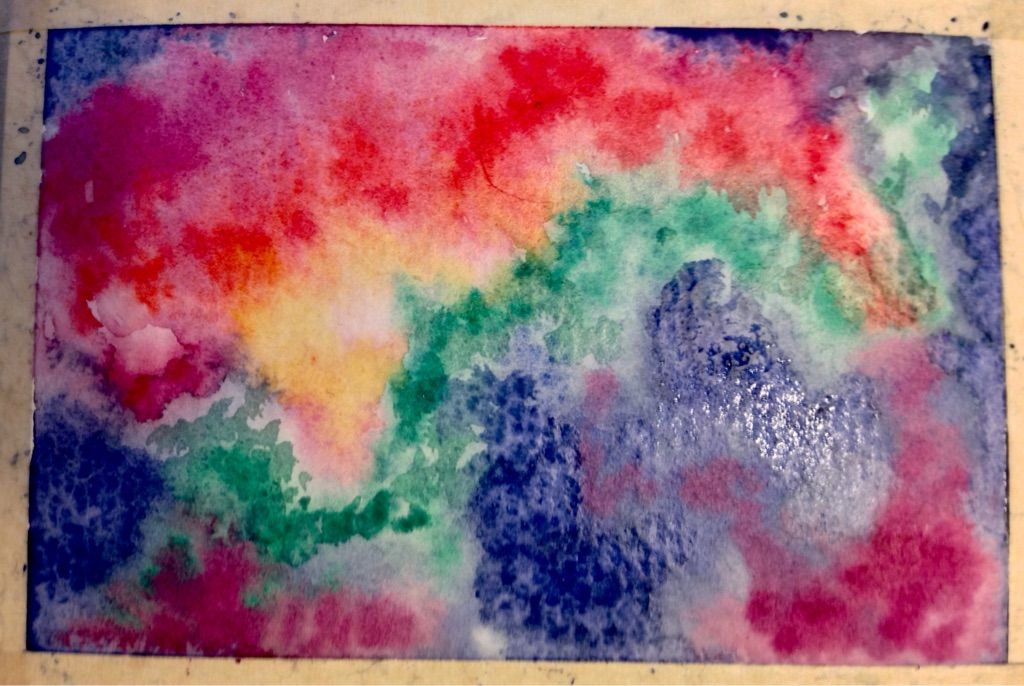
Step 4: As the paint begins to dry, add more intense pigments.
Place smaller abstract dabs of less dilute, pure pigment about the paper as it begins to dry. These will still spread and bleed a bit, but not as much as on the wetter paper.As the paint continues to dry add smaller dabs of even more intense pure pigment.
Step 5: Sprinkle salt.
You want uneven distribution, some larger salt concentrations in the center of the nebula, and smaller ones further out.In my case, I let the painting dry too much before I salted it, so I spritzed it with a tiny, gentle spray bottle full of plain water. Also, in my hurry, I over-salted some areas, and the salt that doesn't dissolve will have to be carefully rubbed off.
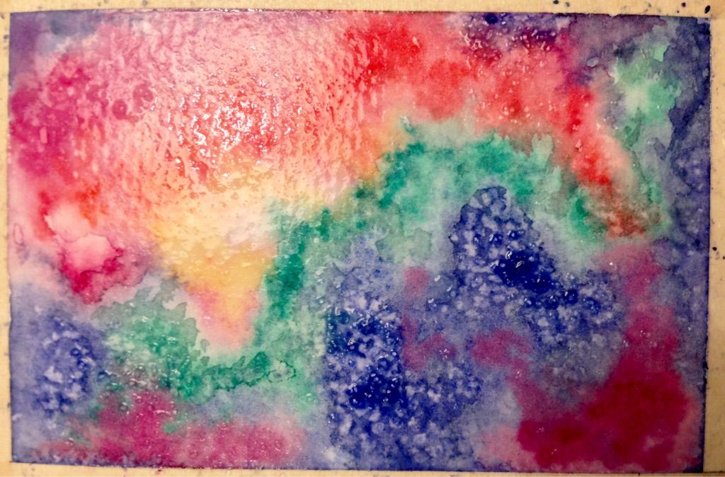
Step 6: Let the painting dry completely.
Rinse your brush(es) and change the water.Step 7: Remove the salt.
Using clean hands, a paper towel, or a small piece of new kitchen sponge, gently brush off the salt.This image looks more intense than the painting at this stage, which is dry.
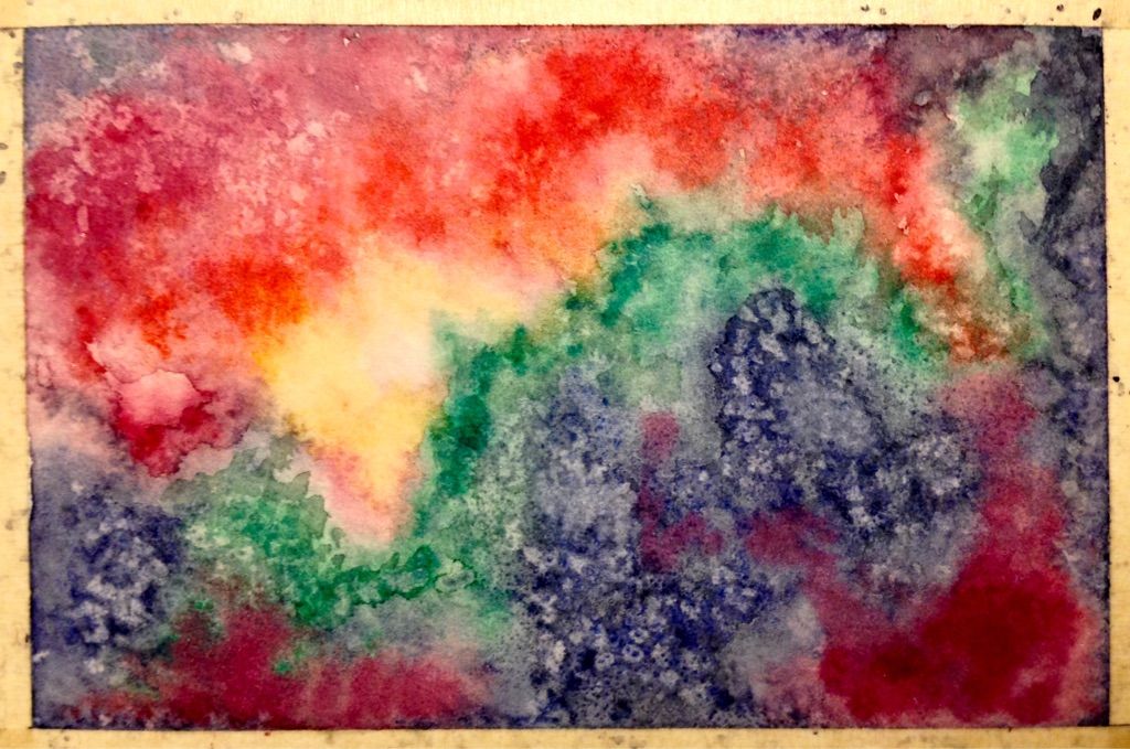
Step 8: Wet the paper on a slight angle.
This is the same as the second step. Do this quickly so as to minimize disturbance of the underlying layers of paint.Step 9: Add more intense, pure pigments on this layer.
Use yet more intense pigments to add this layer.On this small scale, this step covered up the salt patterns, which weren't as dramatic as in the demonstration. I'm tempted to do another salt stage, but I should follow along, and proceed to the next step.

Step 10: With the paper still slightly damp, add dark borders.
This will be a dark blue-purple that fades toward the center. Make sure to fuzz the edges of the borders around the center, so it has a natural cloud-edge.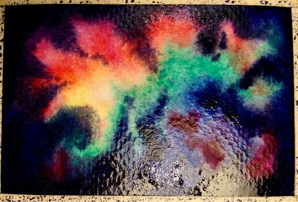
Step 11: Let the painting dry completely.
Rinse your brush(es) and change the water.Step 12: Splatter the stars.
Using opaque white paint with a lot of pigment and little water, load a fine-tip brush, and tap it gently, perpendicularly to another brush handle. Different amounts of of paint on the brush, and different tap strengths will create smaller and larger splatters. You want tiny star-like dots unevenly spread about the nebula. Don't worry about small groupings of 'stars' or non-circular 'dots' because a few of those would be naturally seen in the night sky. Try practicing this technique on scrap paper or a sheet of paper you keep for testing techniques.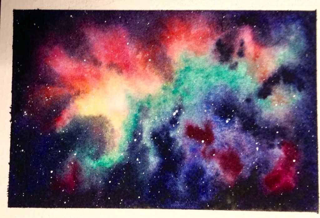
Step 13: Let the painting dry completely and remove the tape.
Rinse your brush(es) and change the water.Results
I left the tape on a blank card on for a week or two--far too long.I need to make a physical color scheme so I test my mixes in advance, and note the names of the colors I use.
I think I missed a layer of color, and if the middle layer is more washed out in the middle, it won't obscure the salt effect.
I like the overall result. Making the above changes should make the painting go faster
and ultimately also look more realistic. This is greeting-card size, so it will do double duty
as part of a set of greeting cards I'll give as a Christmas gift.
and ultimately also look more realistic. This is greeting-card size, so it will do double duty
as part of a set of greeting cards I'll give as a Christmas gift.


